Thoughts on Journalistic Cartography
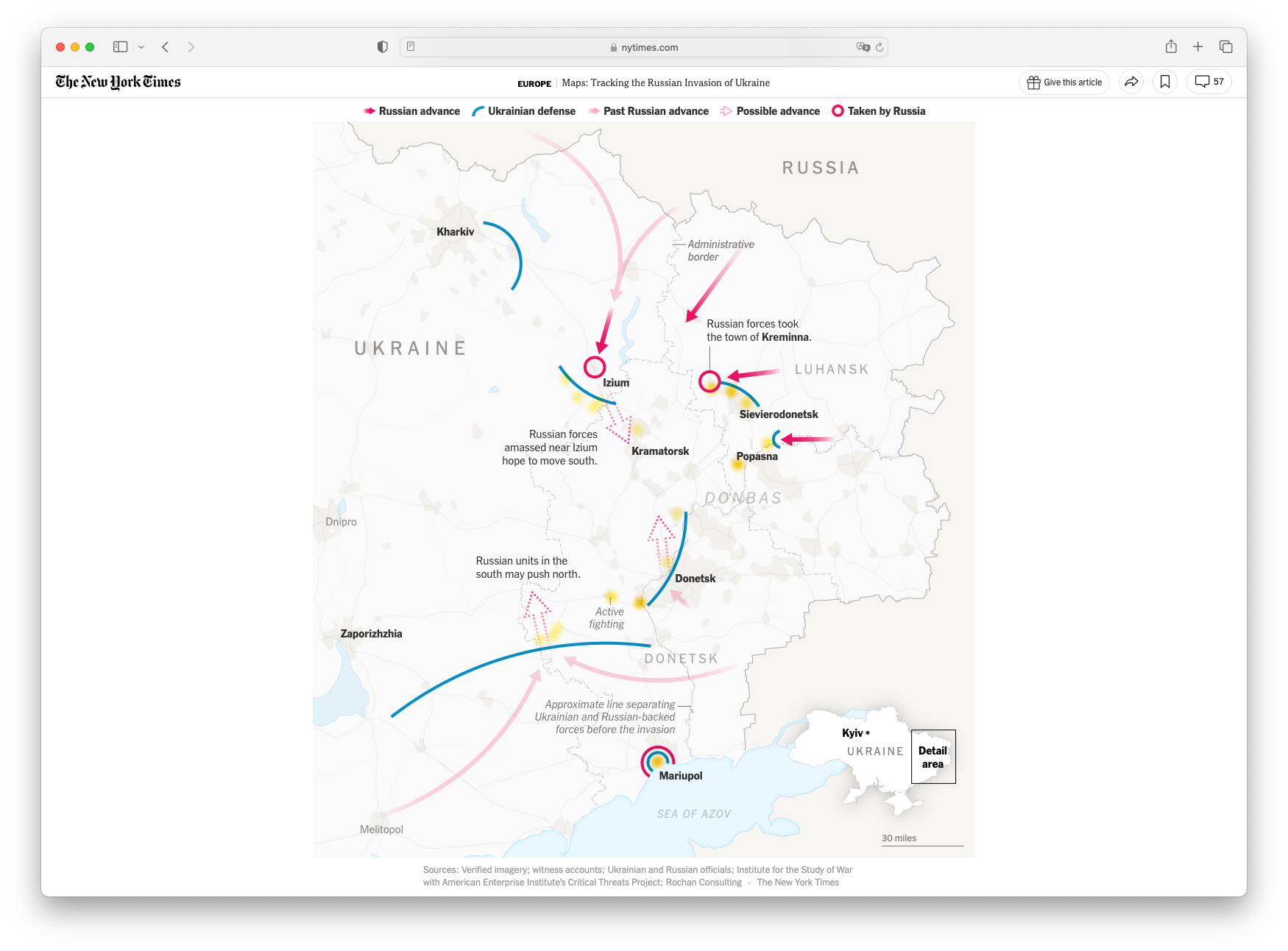
News events of last year have resulted in a large variety of journalistic maps, which have become an indispensable part of reporting and helping readers understand the situation on the ground.

One of the reasons I look forward to the end of the year is seeing all the year in reviews that different news organizations publish. Whether it be a collection of photos from the year, most popular articles, or the year in graphics, these summaries provide a reminder of the news events and journalistic storytelling that were published, and the creative approaches that were built upon or invented in the past year.
News events of last year have resulted in a large variety of journalistic maps, which have become an indispensable part of reporting and helping readers understand the situation on the ground. These maps have helped readers understand the war in Ukraine, the tensions in the Taiwan Strait, the effects of climate change, the political divides across the US, and so much more.
The tools for creating these maps and the conventions for creating interactive and understandable maps have also made huge strides in the past couple years, enabling graphics teams to publish quickly and consistently. For those who work on news graphics day to day, this is not new information for us, but rather advancements that we simply take for granted or even forget their significance once we adapt them into our workflows. But for those who are trying to better understand the technical implementations, whether you a student, editor, or other play another role, this post is a discussion about the current state of things, some suggestions, and the challenges ahead.
Data and graphics journalism has, from its very inception, trodden the line between helping readers understand stories beyond what plain words can do without becoming too technical that only experts can understand. However, as trends change, what readers might understand or not understand changes, allowing for data and graphics teams to also push the envelope on what is a good, understandable piece of data or visual journalism.
The Evolution of Journalistic Cartography
Ten years ago, The New York Times published Snow Fall, one of the earliest examples of visual storytelling on the web that would go on to win a Pulitzer Prize and be widely regarded as the piece that started it all. As a college freshman at the time, I missed the publication of the piece and the resulting discourse around the report at the time, but looking back now it’s clear how far projects have come.
Looking back at Snow Fall now, it’s striking how much of the visual assets were simply embedded into autoplaying, looping, silent videos. Today, while video is still a common format to build visual journalism pieces off of, there has been a trend toward browser rendering or vector formats and animations for better clarity, performance, and interactivity. The 3D topographical model of the mountain as seen in Snow Fall was only possible through rendering a video back in 2012, but today it would be trivial to do something similar in mapboxgl.js for far better performance and resolution, such as this piece on the Monsoons in South Asia.
Design-wise, we’ve also seen maps in news stories evolve to be clearer, better labeled to fit the stories, and colors and colors more carefully picked. Extraneous details are made grayscale or monochromatic, while critical pieces of information are given colors that are bright and clear. Animations and transitions are used sparingly but effectively to draw attention to important changes or layers of a story. Words are rendered by the browser whenever possible to make text accessible and clear. Legends are obvious and intuitive to help the reader understand any special lines or arrows on the map.
Maps have also adapted to social media platforms, being exported in small, bite-sized pieces that are published to Facebook, Twitter, Instagram, where there is even less room for superfluous information. It’s often difficult enough to make sure a map is legible on both desktop and mobile, let alone also optimized for each social media platform. This is where graphics teams have developed all sorts of internal tools to handle the rapid iteration of news graphics, especially when a story may need to be updated live and shared across social media.
SVG and Vectors
One of the most important tools for making dynamic, flexible graphics and maps is to keep things in a vector format as much as possible. Most of the time, this means using SVGs (scalable vector graphics) to display on webpages and mobile applications. SVGs, when rendered through an application, allow for rapid edits and updates. D3, the most widely used tool for data graphics on the web, primarily works by manipulating SVG objects, including powerful functions for handling projections and drawing geospatial data.
SVGs are attractive due to their platform-independent compatibility, such as being able to import an SVG map directly into print tools such as Adobe Illustrator, Indesign, etc. With computers and mobile devices getting more and more powerful, having maps rendered on the client is performant and has the sharpest visual appearance.
However, the challenge for SVG maps on the web is that geospatial data is most transferred as geojson or topojson, which is not a particularly space-efficient format. Generating and transferring geojson files to handle a dynamic, interactive map is expensive, often resulting in files that are hundreds of megabytes, which is unacceptable for users on mobile connections.
One alternative to the geojson format that has gained popularity in recent years is flatgeobuf, a way to host a single file with complex geometries but have the client only download the geographic area it needs via http range requests, which can save a significant amount of bandwidth for large-scale interactive map experiences without the complexity of the other option: generating and hosting tiles, discussed below.
Map Tiles
Map tiles work by splitting up the world into square tiles based on the zoom level and coordinates, so the client downloads and renders only the tiles it needs for the map view. If you’ve used online mapping tools such as google maps and have noticed that the map tends to load in squares, those are map tiles being rendered under the hood.
One of the early, popular libraries for implementing tiled maps is leaflet. Leaflet has a simple, well-documented, and extremely flexible set of tools for embedding a customizable, interactive map into a web page. Leaflet maps are still common today in many news projects. However, the go-to software stack for most web maps is Mapbox. Mapbox allows users to host, customize, and share their own map tiles allowing so many newsrooms with fledgling graphics teams to get up and running quickly with powerful journalistic cartography.
And just as Mapbox has enabled a whole slew of journalistic cartography, MapLibre has been developing an open source version of MapboxGL as MapboxGL version 2 has transitioned to a not quite open source model. The potential for new open source tools to even further transform the way that news organizations create maps is exciting. Tiling tools such as Tippecanoe, PMTiles, and others will continue to evolve and become part of our cartography toolkits.
WebGL
Under the hood of mapboxgl.js is webGL, a browser API that gives access to shaders that are run directly on the GPU for maximum performance in rendering to web browsers. WebGL has been used for games on the web, complex 3D modeling, and more recently cartography applications. While having all of this power to utilize the GPU allows for so much more dynamic and powerful graphics, shader code is written in a completely different paradigm than something like Javascript or Python, making it often difficult to create graphics in WebGL.
So far, the most common implementation of WebGL has been these kinds of wind or weather flows. But as graphics and journalistic cartography becomes an even more integral part of the newsroom workflow, I expect to see more graphics using WebGL, utilizing movement and animations for even more map detail in all sorts of areas.
Looking to 2023
As we start a new year, I’m excited to see the kinds of projects and digital cartography techniques that are published in this coming year, especially as humanity encounters climate, political, social, economic, and cultural challenges. I’m excited to continue building visualizations to accompany news stories, whether it be cartographic or otherwise.
Shameless plug: I am open to freelance or contract roles for this year, so if you’d like to work with me on a project, don’t hesitate to reach out!