Intro to HCI Lecture 4 – Cognition and Design
These are my notes in essay form from the Intro to Human Computer Interaction course taught by Scott Klemmer at the University of California, San Diego.

These are my notes in essay form from the Intro to Human Computer Interaction course taught by Scott Klemmer at the University of California, San Diego. All credit for content goes to Scott, any errors are my own.
When it comes to user interface design, one consideration to be made is understanding the mental model that a user may have when they see different elements of the interface.
Mental Models
Stanford’s computer science building has two adjacent doors, only one of which opens from the outside. But despite the fact that only one door opens, both doors have identical handles. This leads users to think that they can enter from either door, and when they try to enter from the door on the right, they find that it does not open. A simple solution to this would be to remove the exterior handle from the door on the right, making it easy for people to understand that only one door opens.

Another example from Don Norman in The Design of Everyday Things is the mental model of refrigerator design. Let’s say a refrigerator has two dials, one of which is labelled with letters A through E, and the other is labelled with numbers 3 through 7.
Intuitively, you would expect one dial to control the cooling unit of the freezer and the other dial to control the cooling unit of the refrigerator. However, this refrigerator only has one cooling unit and the dials controls a splitter that determines the proportion of cooling that goes into the freezer or the refrigerator. Thus, in order to make the refrigerator colder while maintaining the temperature of the freezer, you have to move both dials. A lot of users misunderstand the function of these two dials and get it wrong. This is an example of a poor user interface because the user’s mental model is different than the actual model.
One pitfall of being a designer is that you’ve often spent so much time under the hood that you expect users to have the same understanding of the interface as you do. This is why it is helpful to have people who are not designers in front of the user interface as soon as possible. Having people use the interface helps you discover the differences between your mental model and theirs. Having a congruent mental model allows users to avoid errors and simplifies and prevents the user from getting frustrated.
To explain how mental models are formed, there are a few considerations. The first is that new interfaces are often learned by thinking in terms of an old interface they may be more familiar with. You can be very successful by realizing what people are familiar with and leverage that to help them learn a new interface. For example, if you explain a word processor like a typewriter, people who have experience with typewriters can easily learn how to work a word processor, and transfer their beliefs and skills over to the word processor.
We all have models and beliefs about everything, ranging from our behavior, others, objects, and software. This is not to say that our mental models are organized, but often the opposite. Most of our models are incomplete, inconsistent, change over time, and often rife with superstition. This leads us to the concept of the execution gap, which is the difference the gap between what a user perceives that a tool should accomplish and how they actually do that.
Thus, the best user interfaces are ones that allow the user to clearly achieve the tasks that they intend to do. In order to create user interfaces that are easy to use in accordance with a user’s mental models, there are a few points to consider.
- Visibility is about making actions visible. If the user performs an action on an interface, the interface should provide some sort of visible feedback letting the user know that an action has been performed.
- Feedback is about the process that a computer does, and providing clear results for the task at hand.
- Consistency is about creating a uniform experience for the user to engage with so that they can build a new mental model around how your interface actually works.
- Non-destructive interfaces are easy to undo in the case that a user makes a mistake.
- Reliable interfaces accomplish the task reliably, avoiding errors as much as possible.
An excellent example of the points mentioned can be seen when comparing graphical user interfaces (GUIs) with command line interfaces. For most of these categories, having a GUI is far superior to using the command line. In a GUI, moving a file from one folder to another can be achieved with a drag and drop, which allows the user to visibly and directly interact with the filesystem in a non-destructive, consistent way. The only advantage that a command line interface has over a GUI is reliability.
Although using existing mental models to explain new interfaces can help users get accustomed to the new interface faster, the problem is that at some point the metaphor needs to break down in order to allow the new technology to be truly effective. Since new technologies usually introduce new and better ways of accomplishing a task, sometimes old mental models will never translate completely, and sometimes they may not translate at all.
Thus, your job as a designer is to minimize the difference between the new technology and the old as much as possible.
“If technology is to provide an advantage, the correspondence to the real world must break down at some point.” – Jonathan Grudin
Two Types of Errors
Another consideration when building products is recognizing different kinds of errors that are based on the user’s mental models, namely the difference between a slip and a mistake.
The first category of error is a slip. A slip is when a user has the correct mental model of how a system works, but accidentally made the wrong action. For example, if a user accidentally clicks the wrong button because of a motor error, that is known as a slip.
A mistake, however, is when the user does exactly what they intend to do, but they have the wrong mental model of how the system works. For example, if a user takes a freeway exit thinking that it will take them where they want to go, the user made a mistake due to an inaccurate mental model of where an exit would lead them.
In your design, you will correct and prevent these two errors differently. Slips are minimized by improving the ergonomics or the visual design of your interface by spreading things out and making things bigger, while mistakes are minimized by providing more information and feedback, making it clear as to what the software is going to do.
One example is a presidential voting ballot in the 2000 elections. Due to a poor layout of the ballot, it is hypothesized that many people made the mistake of voting for Pat Buchanan. Pat Buchanan received 0.85% of the votes from people who used this ballot, but only 0.2% of the votes from people who voted absentee or used a different style of ballot.
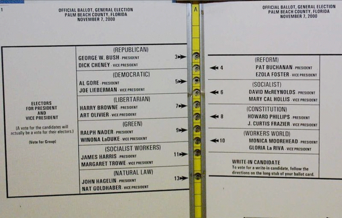
These erroneous votes are the result of a mistake because voters performed the manual task of punching the second hole, but had an inaccurate perception of what the second hole meant. A better user interface design could have avoided these problems.
One potential solution for a unified nationwide voting system would be to use an electronic voting system. An electronic voting system has a lot of appeals, such as a easy way to internationalize to a large variety of languages, providing pictures of candidates, and using a touchscreen so that users can directly manipulate what is on the screen. However, the major problem with digital voting systems is ensuring that the machine recorded the vote that you made. One solution to this user interface is for the machine to print out a receipt of your vote that is placed into a bin to be physically counted later to double check the voting results.
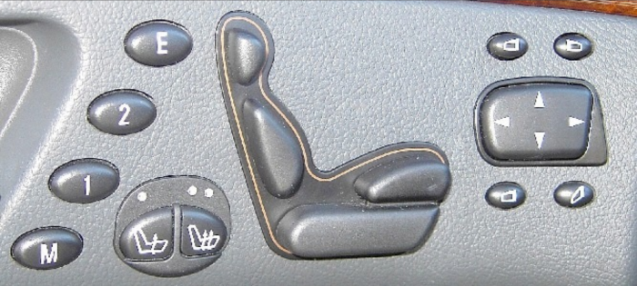
An example of a good interface are the miniature controls on the seats of some cars. The interface to manipulate different parts of the seat is a miniature seat itself. This reduces the potential for confusion in users.
One example of maximizing the benefits of new technology while minimizing the difference between old technologies is the system for DJs called final scratch. In Final Scratch, the DJ uses two turntables that send a code to the computer instead of playing music directly. The computer then is able to convert the code into the song that is being played and play that from the speakers. This allows the DJ to play anything, even things that are not on vinyl. It also allows all the benefits of digital music.

Distributed Cognition
There are many ways interfaces can help people think more fluidly. Distributed cognition is the idea that knowledge lies not only in the individual, but also in the individual’s social and physical environment. When interfaces help people to distribute cognition, it has major effects on the way that users interact with the software.
Distributed Cognition Encourages Experimentation
The first example of an interface distributing cognition comes from the game of Tetris. In this game, players move and rotate falling blocks in order to create rows that destruct and earn the player points. Tetris provides a visual instantiation that allows users to visually see what is happening.
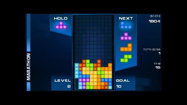
When observing the way that people play Tetris, it was discovered that people rotate and move pieces around more than they need to in order to test different possibilities of where a block may be placed. This is an example of distributing cognition, because it requires less effort and is therefore “cheaper” to experiment by actually moving and rotating the blocks.
Distributed Cognition Shows Only Differences that Matter
Another example of visual representation is the London underground subway map. About a century ago, a new style of map was introduced that visualized subway stops in a different way.
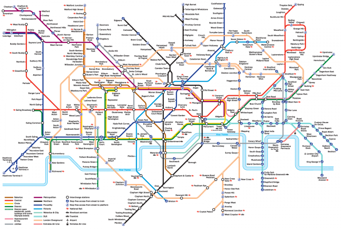
Instead of staying true to the underlying topology of the geography of London, this map was the first to lay things out in a much simpler way using vertical, horizontal, and diagonal lines to represent different routes, stripping out the details of topology. This map was beneficial because most users didn’t care too much about the actual distance between routes, but merely needed a way to see the order of the stops.
Another advantage of the London subway map was that in downtown, most of the subway stops are closer together, while stops in the suburbs are fewer and further in between. Instead of having the routes to the suburbs occupy 90% of the map, the map spaces out the stops in downtown in a way for people to easily see all the stops.
However, this kind of representation may not appropriate for all use cases. By simplifying and improving readability on all the stops by neglecting topological distance, it can be deceiving to someone trying to figure out the distance between two places, or anyone looking at the map with the intent of figuring out anything related to distance.
Therefore, the way that visual design is approached should be application specific. A good representation is tight to the task a user wants to perform.
Distributed Cognition Converts Slow Calculation into Fast Perception
Colors can also be used as a representation to distribute cognition. In a map showing the elevation of land and depth of the ocean around Japan, one design approach is using hue as a representation for elevation. However, using hue is hard to understand because it is not intuitive what different colors represent in terms of elevation. A better approach to using color in this situation would be to use luminosity.

In the redesign of the map, Edward Tufte used blue to represent anything underneath the surface of the water, while using a brown tone to represent land above the water. Using luminosity rather than hue allows the reader to much better visualize how deep a certain part of the ocean is or how high a certain point on land is.
Distributed Cognition Supports Chunking
Both user interface and game design is concerned with how easy or hard it is for a user to perform a task. The difference is that interface designers usually try to make it easy, while game designers usually try to make it the right kind of hard. This leads to the concept of chunking, which allows users to execute a common group of actions together in order to simplify the process.
For example, moving a block of text within a document is a common practice that often takes three steps of first cutting the text, moving the cursor, and then pasting the text. By being able to select and drag a selection of text, the user interface has effectively chunked the three actions into one simple motion, making it easier for the user to perform the task.
Distributing Cognition Increases Efficiency
Often, designers must decide between representing information textually or representing information visually. Although there is no simple answer to when one should be used over the other, one instance in which information should be displayed visually is when you can convert slow reasoning task into fast perception tasks through a visual representation. For example, using a graph to spot trends is much easier than using a table of numbers that require a lot of reasoning to understand.
We’ve all heard the saying that a picture is worth a thousand words. This statement implies some kind of ratio at which one is interchangeable with the other. But just because two representations are informationally equivalent doesn’t mean that they are also computationally equivalent. In other words, just because two representations have the same information present doesn’t mean that it takes the same amount of effort to extract the information.
This is one area in which graphical user interfaces have an advantage over command line interfaces. Graphical user interfaces allow users to easily perform tasks visually, distributing the cognition required of the user.
Another example of a product that increases efficiency for users is the oxo measuring cup. By enabling the user to see how much liquid is in the container from above, users no longer have to bend over to the counter level to see how much liquid is in the measuring cup.

“Solving a problem simply means representing it so as to make the solution transparent” – Herbert Simon
Consider a two player game which has the following rules (try playing it with someone):
- Each player takes turns picking numbers between 1 and 9, inclusive.
- Once a number is picked, it cannot be picked again by either player.
- The first player that picks a combination of 3 numbers that adds to 15 is the winner.
In this game, players often have to think extremely hard to keep track of the numbers they have chosen, the numbers their opponent has chosen, and which numbers they want to choose. In fact, players often end up making mistakes and choosing numbers that have already been chosen, or numbers that they later realize they didn’t want.
Let’s compare that game to a game that everyone is familiar with, namely tic tac toe. Tic tac toe is represented in a three by three grid, in which players take turns to pick squares that will create either a row, column, or diagonal.

If you really think about it, you’ll realize that the two games are isomorphically identical. In other words, you can assign a number to each square in such a way that every row, diagonal, and column adds up to 15.
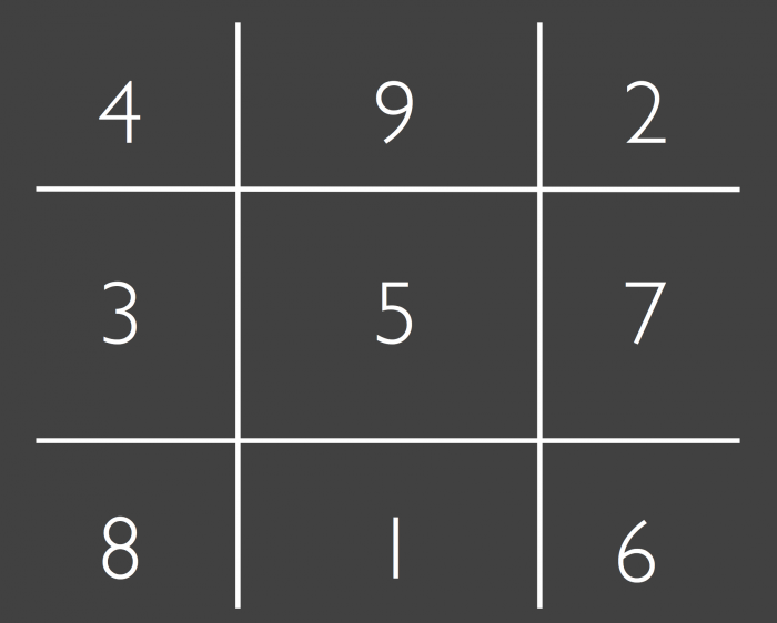
These two games are the perfect example of how effective a power user interface can be. By simply representing the game in a different way, we’ve made it much easier for people to play, reducing the amount of cognitive effort required to play the game by reducing the amount of working memory necessary.