Intro to HCI Lecture 3 – Heuristic Evaluation
These are my notes in essay form from the Intro to Human Computer Interaction course taught by Scott Klemmer at the University of California, San Diego.

These are my notes in essay form from the Intro to Human Computer Interaction course taught by Scott Klemmer at the University of California, San Diego. All credit for content goes to Scott, any errors are my own.
After you’ve made your prototypes, the next step is learning how to properly get feedback from people. There are many different ways to get feedback, but simply asking for feedback is often hard to organize and understand. Users who simply tell you that they like or dislike something is not an interesting conversation.
You can empirically access your product with real users, use formal methods and formulas to calculate measures, or you can use a critiquing framework such as heuristic evaluation. With heuristic evaluation, you begin your review with a clear goal. Developed by Jakob Nielsen, heuristic evaluation allows you to easily find usability problems in design.
Before a Heuristic Evaluation
The first question to ask when it comes to getting design critique is figuring out when to get critique. You can get feedback at any point in the design process, but there are a couple points that may be particularly helpful.
The first point to get design critique is before user testing. By getting critique and fixing small usability issues, users who test your product are able to better focus on the big issues. The second point is before a redesign. To avoid throwing out the baby with the bathwater, a proper critique helps you learn what works and what needs to be improved. Thirdly, critiques should also be performed when you know there are problems, but you need evidence. And finally, smooth out the rough edges before a release by performing a final critique.
Next, in order to perform a heuristic evaluation, you need to find evaluators to evaluate your user interface according to usability principles, known as heuristics. To diversify feedback, it helps to have multiple heuristic evaluators work independently and then communicate afterwards to aggregate findings. Having multiple evaluators is helpful because no single evaluator finds everything, and some evaluators find more than others.
Heuristic evaluation works well on working user interfaces as well as wireframes, making it highly compatible with the principles discussed in rapid prototyping such as paper prototypes. It works with designs of any fidelity.
Additionally, from a cost-analysis standpoint, heuristic evaluations are also extremely cost-effective. One analysis of heuristic evaluation found that a company benefitted approximately $500,000 from results generated in heuristic evaluation when applied to increase productivity, while only costing the company $10,500.
Compared to user testing, heuristic evaluation is much faster and affordable, and are often able to find the most severe problems easily. Another benefit is that because of the nature of the heuristics the results come pre-interpreted, making it easy to know exactly what to redesign. However, user testing by definition is always more accurate than heuristic evaluations, because you are testing the product in the exact scenarios that it is to be used. Thus, heuristic evaluations can often generate false positives, leading you to consider some aspects as problems when they may not necessarily be a problem.
Thus, when it comes to testing, it often is valuable to alternate testing methods in order to maximize for cost, effectiveness, and time.
Conducting a Heuristic Evaluation
To conduct a heuristic evaluation process, begin by giving your evaluators any needed domain knowledge and information on the scenario. You can do this by sharing your storyboards, video prototypes, or any other information that may give the evaluators the necessary background information for you interface.
Each evaluator should pass through the interface flow at least twice. The first pass allows the evaluator to get a good feel for the flow and scope of the system, while the second pass allows the evaluator to focus in on specific elements. While they step through the flow, each evaluator should consult the list of heuristics (explored in detail further down in this post), and make notes on anything that they notice.
The comments should thoroughly explain the problem with reference to a specific heuristic. Comments can be specific to the wording of a certain label in the interface, or can be general to address to flow of the user interface, as long as the design team is able to understand what the problem is. Comments can even be about aspects that are missing in the user interface, which is often the case especially in paper prototypes.
For each comment that an evaluator makes, have them determine how severe each identified problem is. This helps give the design team feedback on which problems they may want to prioritize. For example, a problem identified in one page in the user interface may not be as severe as a problem that affects every single page of the interface.
When determining severity, the frequency, impact, and persistence of the problem should be factored in. According to Nielsen’s framework of heuristic evaluation, severity ratings are between 0 and 4, with 0 being that it is not a usability problem and 4 being a usability catastrophe.
Each violation should be listed separately in order to better organize the problems identified. Listing each problem separately minimizes the risk of repeating problematic aspects, and makes each problem clearer and easier to understand.
Finally, have the evaluators share their findings and aggregate all the problems and severities that they have found in the interface. The design team can then take the feedback they received from the evaluators and decide what they would like to do with the feedback.
The debrief is a great time to clarify the feedback, and brainstorm ways to fix the problems as well as develop ways to implement new features with all the stakeholders in one place.
The Ten Heuristics
As mentioned above, Nielsen has a set of ten heuristics that can be used as guidelines to evaluating user interfaces. These guidelines are not all encompassing, which means the evaluator can make comments or suggestions that do not necessarily belong with one specific heuristic.
Show system status
The system should always keep users informed about what is going on, through appropriate feedback within reasonable time. This helps the user know what the progress of the current task is, and where he or she is in the larger system flow.
In situations where the user is waiting on the system, the user interface should provide some sort of status indicator. If the task that the system performs generally takes less than one second, the system can simply show the outcome. If the task takes approximately a couple of seconds, then there should be an indicator to let the user know that progress is underway. And if the tasks takes over a couple of seconds, it is a good idea to have a fractional status indicator showing the current status and time.

Another example of system status is space. In the following example, gmail provides an indicator letting the user know that they are out of space.
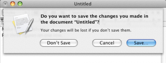
The third example of system status is change. The dialog boxes that appear when forgetting to saving files will often warn you about pending losses to the information at hand.
The fourth example is action. For instance, a stoplight prompts a specific type of action, whether it be recognizing that a driver can cross a street or a driver should not cross a street. The stoplight is also an example of a good interface because it also provides a redundant method of indication, putting red at the top and green at the bottom. This redundancy allows stoplights to serve a wider base of users.
The fifth example is showing information about next steps. Especially in an online world, it is good practice to let the user know what is happening next.
And finally, after finishing whatever task is at hand, it is good to indicate that a process has completed.
Familiar metaphors and language
The system should speak the users’ language, with words, phrases and concepts familiar to the user, rather than system-oriented terms. Follow real-world conventions, making information appear in a natural and logical order.
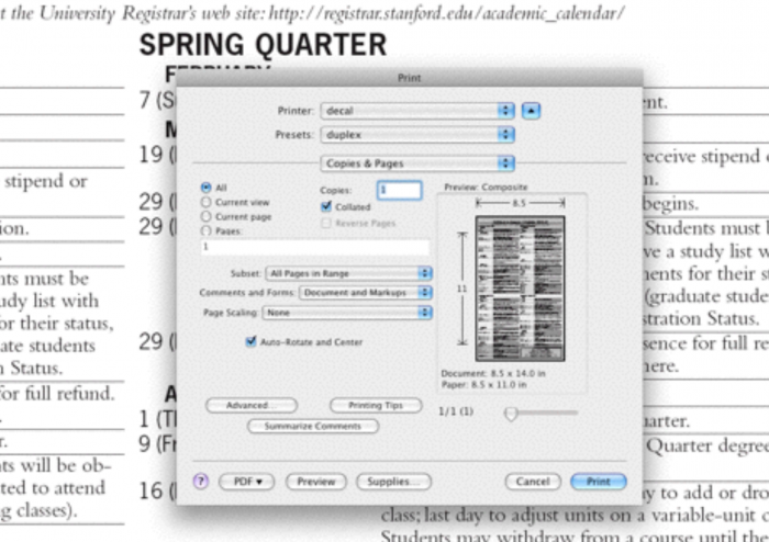
One example of an effective metaphor is found in the print dialog box, because it shows which parts of the page are going to be cropped and which parts are going to be printed in a very clear way. In general, one of the advantages of the graphical user interface is that it leverages a lot of real world metaphors such as the desktop, files, trash, folders, etc.
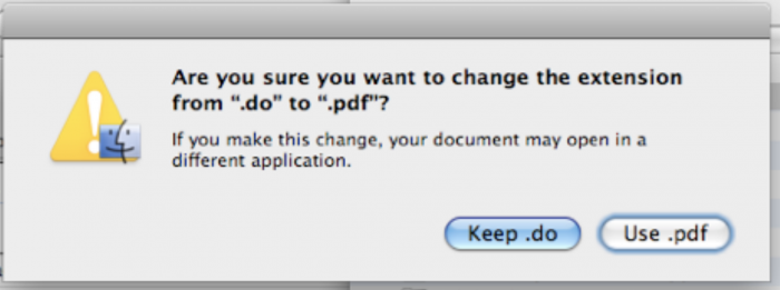
Choices are another area in which it is helpful to use familiar language. Even if a dialog box uses language that may be a bit more technical, make the choices clear for people who may not be as technically aware.
User control and freedom
Users often choose system functions by mistake and will need a clearly marked “emergency exit” to leave the unwanted state without having to go through an extended dialogue. Support undo and redo.
If the task being done is a task that is only done once, a constrained wizard may be helpful to guide the user through the process. However, the user interface should always provide the user with a way to exit out of a flow or go back. Allowing the user to explore gives them the freedom to interact with the interface the way they want.
Consistency and standards
Users should not have to wonder whether different words, situations, or actions mean the same thing. Follow platform conventions.
Just like familiar language should be used in your interface, consistent language should be used as well. Despite the fact that a design team may be organized in a certain way, the user may not see their experience in the same way. This difference between designers and users can be confusing for users navigating your interface.
One solution to this problem is to train your users and design team to use the same language when referring to the product, making it easier to understand from both perspectives. Being very specific about what interface choices do can also help provide a more standard experience across all users.
Error prevention
Even better than good error messages is a careful design which prevents a problem from occurring in the first place. Either eliminate error-prone conditions or check for them and present users with a confirmation option before they commit to the action.
The first kind of error to prevent people from making is data loss. For example, if a file is about to be overwritten, a user may not recognize what is in a file simply by looking at the filename, which means the user could run the risk of unintentionally overwriting data.

You can also prevent errors by preventing duplicates and clutter. Warning users that files may potentially be a duplicate is a great way of preventing users from accidentally doing something twice. Removing clutter and confusing flow also helps the users accomplish what the intended to do.
One advantage of graphical user interfaces is that they can use a visual structure to limit the errors that a user may make. For example, anything that you can type into a graphical search form can be used as the term to search with, while searching via the terminal must be done with the specific command syntax.
Avoiding unnecessary constraints helps reduce the number of errors that users encounter. In many situations, the user may perform a task only to find that some constraint on their task caused an error. Removing unnecessary constraints helps the user through the application flow much more smoothly.
Recognition rather than recall
Minimize the user’s memory load by making objects, actions, and options visible. The user should not have to remember information from one part of the dialogue to another. Instructions for use of the system should be visible or easily retrievable whenever appropriate.
Interfaces should avoid use of cryptic codes, conventions, or other knowledge that the user may need to remember when interacting with the interface. Interfaces should be as easy to understand as possible. Any time you notice a post-it note used to explain or remind a user of something, that is usually a problem caused by users needing to remember some key piece of information in order to perform a task.
Recognition is also about avoiding extra hurdles that a user may have to go through in order to accomplish their task. Sometimes this means initializing the interface with reasonable defaults to make a task faster for your user.
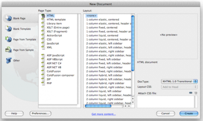
In addition to initializing with reasonable defaults, it is also valuable to provide previews. Offering previews helps users to recognize whether or not the choice they are making is the one that they want rather than relying on a description or previous knowledge.
Flexibility and efficiency
Accelerators, unseen by the novice user, may often speed up the interaction for the expert user such that the system can cater to both inexperienced and experienced users. Allow users to tailor frequent actions.
The easiest way to increase efficiency is to provide keyboard shortcuts for experienced users to navigate your application better.
Another example of increasing flexibility is being able to look under the hood at the HTML of a web page. This is not necessarily something that everyone will want to do, but it offers experts with the ability to see how a web page is built.
Flexible interfaces can also display ambient information that may be relevant to the interface at hand, such as showing the weather forecast on a calendar application. Recommendations can also serve as a flexible interface element that can help the user be more efficient at the task they are trying to accomplish. However, if you use recommendation, remember to keep it relevant so that it’s not distracting to the user.

Even though flexibility is important, it is also important to not go overboard with choices to avoid confusing the user and making it difficult to find what he or she is trying to do.
Aesthetic and minimalist design
Dialogues should not contain information which is irrelevant or rarely needed. Every extra unit of information in a dialogue competes with the relevant units of information and diminishes their relative visibility.
One of the characteristics of designing for the web is that the user can only see part of the web page at a time, leading to the distinction between above the fold (initially visible content) and below the fold (content that is accessed by scrolling). It is important to make the core components of your software visible as much as possible, keeping it above the fold. Additionally, it helps to lay out forms and other interfaces in a simple, intuitive way to simplify the process and save space.
When using colors, use them in a way that the colors mean something. Avoid inundating your users with colors that distract from the flow of the interface.
Recognize, diagnose, and recover from errors
Error messages should be expressed in plain language (no codes), precisely indicate the problem, and constructively suggest a solution.
The first step in sending an error is to make the problem clear. An error that does not provide a clear explanation of the problem often leaves users confused as to what their next steps should be.
The next step is providing a solution to the problem. Simply notifying the user of a problem may not be as helpful as recommending ways to fix the problem. Providing a way forward helps the user to continue the task at hand without disrupting the flow too much.
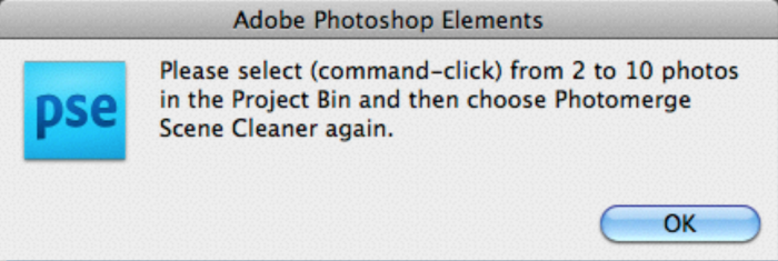
Another consideration when recovering from errors is to propose an alternative. Especially in the world of online searches, it is helpful to provide alternatives in the case that a search returns no results.
Help and documentation
Even though it is better if the system can be used without documentation, it may be necessary to provide help and documentation. Any such information should be easy to search, focused on the user’s task, list concrete steps to be carried out, and not be too large.
It can be assumed that help and documentation is someone else’s problem and not a part of the interface, but with the growth of online applications, help is becoming more common.
One example of this is the learning process for learning new programming languages. Most languages have their documentation online, which serves as a guide for programmers to receive help learning.
Another example is pointing out new features in the application when they are released, helping the user recognize how a new feature might be beneficial to them.